Badge
The Badge component allows you to display small, attention-grabbing labels that provide additional context to items such as statuses, counts, or categories.
Basic badge example
To create a basic badge, use the <span> element with the badge class. Here’s a simple example:
<span class="badge">New</span>This will render a small badge with the label "New." By default, badges use neutral styling, but you can apply additional classes to change their appearance.
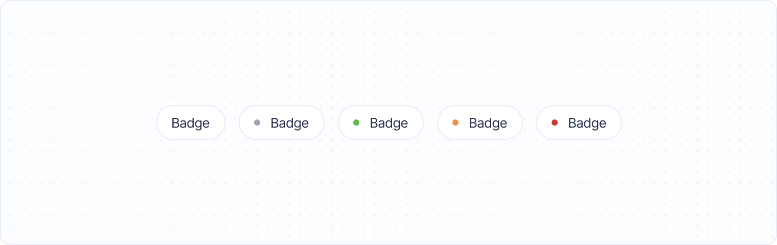
Pill-style badge
For a color-coded badge, you can add the pill class. This will give the badge a little color dot in front to represent its status. You can use the pill notation to set different colors.
<span class="badge pill">Default</span>Combining badges with other elements
Badges can be combined with other UI components, such as buttons, lists, or cards, to provide additional information in a clear and compact way. Here’s an example of a badge being used with a button to show the number of new notifications:
<ul>
    <li class="row">
        <span>Notifications</span> <span class="badge pill pill--red">3</span>
    </li>
</ul>
This setup shows a button with a blue badge indicating the number of new notifications, enhancing the user interface by providing key information directly on the button.